µTorrent Streaming
Designing µTorrent Streaming
BITTORRENT, INC.
2014-2015
What is µTorrent Streaming?
One of the things my team, the monetization team, was responsible for is adding new features to µTorrent Pro. Our goal was to add new value to µTorrent Pro that supports the company’s new focus on media consumption and monetize it. The developers on the team came up with a new technology to play files in torrents while they are still downloading. We added streaming to µTorrent as a first step toward creating a media consumption use case.
What does it look like?
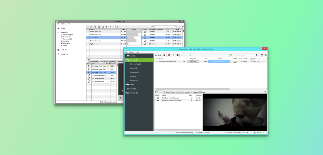
µTorrent Pro’s streaming feature is located in its main screen, called torrents. We needed to give users a way to select a torrent, see the files within it, and choose one to play. The UI element has a list of files on the left that corresponds to the torrent the user has selected.We also needed to indicate to them if a file they want to play can be streamed or not. Each file has an icon next to it that indicates if it is not playable yet, is streamable, or has been fully downloaded. Finally, there is a media player to the right of the list of files. The player plays video and audio and can be expanded to full screen.

Here is a case study of designing the part of the system that shows users which files they can play.
File State System Iterations
I worked with the engineers on my team to understand the technology behind Streaming and figure out how we can surface it to people in a useful way. When a user adds a torrent to µTorrent, it analyzes all the files in the torrent over and over to determine if they can be streamed. It analyzes repeatedly because
Streaming depends heavily on a lot of variable factors like internet connection speed and the health of the torrent. From these initial work sessions, we established that files transition through 4 states:
Analyzing: µTorrent is determining if it can stream the file
Previewable*: There is enough of the file downloaded to play about a 15 second clip
Streamable: We are confident the file can play uninterrupted
Downloaded: The file will play uninterrupted because it’s fully downloaded
We also had an unplayable state if µTorrent doesn’t support the file type.
* We made previewing a separate feature because a large portion of our international users live in countries where ISPs charge for service by the byte instead of a flat monthly fee. This feature would allow them to evaluate a file before they literally invest money in downloading the entire thing.

The challenge became figuring out how to represent these states to users in an intuitive way.
Iteration 1: Analyze -> Preview -> Stream -> Downloaded
In the first design for this system, I gave each state an indicator in the UI. Analyzing files would have a spinner, unplayable files would have a red icon, previewable files would have a yellow icon, and both streamable and downloaded files would have a green icon. We thought a “stop light colors” metaphor would be easy for users to understand and help them make decisions.

The flow would all take place on the torrents screen: A user adds a torrent, it appears in the torrent list. They click on the torrent and it’s files show in the bottom half of the screen. Depending on the state indicator, the user can click on a file to play it.
Changes:
One of the most interesting parts of creating this feature is that it was highly theoretical as it came together. Even our engineers weren’t quite sure how well parts of it would work or how far it could be optimized. One of the pleasant surprises we got as designers is that our data showed that files would pass from previewable into streamable much more quickly than anticipated. We also observed users grasping the idea that they could just watch the first part of a streaming file to evaluate it and remove it if it wasn’t what they expected. This was an opportunity to simplify. We removed the concept of a previewable state so it wouldn’t potentially add noise to the streaming experience.
Iteration 2: Analyze -> Stream -> Downloaded
At this point, we conducted a few user tests. I wanted to understand more about how users naturally perceived the different states given their typical experiences with streaming products like Netflix or Hulu. We showed users a few paper prototypes with the icons we were thinking about using to indicate the file states.
Issues:
We had some interesting findings around our analyzing state. First, we saw that though users understood analyzing files were not ready yet in some way, they still expected to at least get more information about it. We observed users trying to click on the analyzing spinners to either make them play or to see how long it would take to play.
Another issue that came up with the analyzing state in a design review was that in edge cases where the user adds a torrent with a really large number of files (50+), the screen could become overwhelming with too many spinners. Our PM was really concerned about this edge case.

Fixes:
Watching people use our interface gave me a much stronger idea of their mental model of the system and the goals they were trying to accomplish with it. Seeing so many people try to click analyzing files helped me understand that we needed to give them feedback for that action. We also needed to continue to try new icons to communicate a message that’s more in line with users’ goals (“can I play this file or not?”). It made me realize that we needed to take a step back and reevaluate how we communicate the states to the users in the first place.
We changed the icons we were using to target different messages and added feedback for when users clicked files µTorrent was not ready to stream yet.

Iteration 3: Not Yet -> 80% Sure -> Definitely:
At this point, we had a working build of Streaming we could test with on our computers. We added in messages as feedback when users clicked on analyzing files. I decided that the video player area was a good place to message the user when they clicked on them because that area of the screen would have their attention. One of the technical limitations of the feature is that it is not possible to determine how long it will take for a file to start streaming. However, we were able to optimize the technology to make the wait shorter. In this iteration of Streaming, when the user clicks on an analyzing file to try and play it, that file receives download priority and should become streamable more quickly than usual.
![]()
Issues:
One of the last UX issues we wanted to address was that users weren’t understanding the difference between streaming playback and downloaded playback. We were questioning if they even should be concerned with the difference. Users just want to know when they can play a file and having multiple play buttons with very similar icons was confusing.
Fixes:
To help users understand that a file was still downloading while it is playing, we also showed the pieces of files that were already downloaded in real time on the video player’s timeline, similar to YouTube. This helped a lot with users understanding that files were still downloading and missing pieces. We had written stories in our backlog to remove the extra play button icon. The plan was to take on those stories once we optimized Streaming to be at least 90% reliable.

Moving Forward:
At this point, we had gotten to a pretty good place with people understanding how the feature works in user testing. We were also at our deadline. We continued to work on the feature, but our approach was different. We wrote stories for µTorrent’s backlog so we would always have design work ready when we had a light sprint.
The next things we were working on were:
Updating the icons used to indicate the files’ play statuses – Users we observed were understanding the difference between streaming playback and downloaded playback, but we knew we could do better in communicating this with our icons.
Priority system – We wanted to give users a more explicit way to set particular files within torrents as top priority. There was no way for them to know they were doing that when it happened automatically from clicking analyzing files.


